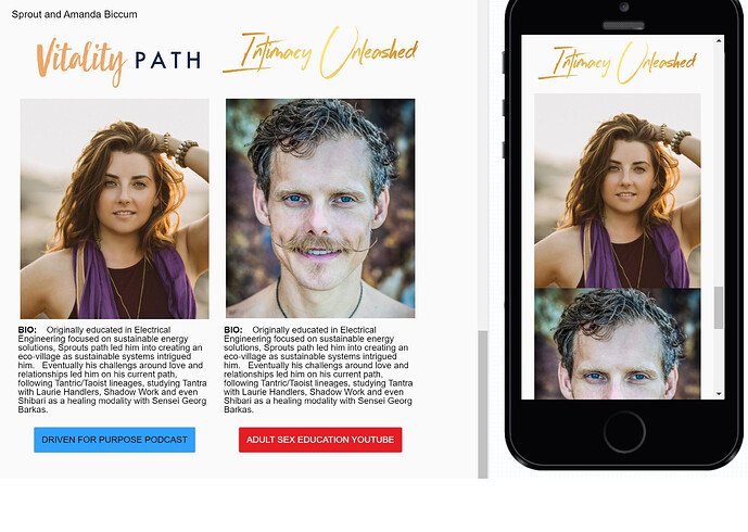
Challenge is that i’m making an email campaign template, and i wanna have the branding/bio/images grouped together so that stay together on mobile. you can see the desktop version how i want the logo/image/bio stacked and then have the two bios side by side, but on mobile because the images are on the same line, they go back to back, does this make sense and can i make it on phone to stack the logo/image/bio as one?
Hey intimacyunleashed,
Biannca here from our CX team, sorry we missed this when it was originally published.
In the spirit of providing insight on this question, it seems like the design of the email isn’t stacked/laid out correctly which is causing the layout Image > Image > etc.
This is the formatting we recommend when it comes it ordering your content https://screen.ac/z8uowyY6. Once you have followed the layout, the email should render like this on mobile when it collapses, https://screen.ac/ApumyZGK.
For more information on email mobile designing, see our help guide.
Please don’t hesitate to reply back out if you have any further questions.
